Last weekend, I finally redesigned my blog.
Not by opening Figma.
Not by sketching half‑formed ideas in isolation.
And not by writing CSS until I knew what I was building.
Instead, I treated the redesign as a small experiment: could I take an existing, real website, allow an AI tool to infer its design system, explore a new direction within those constraints, and then move straight into implementation without a traditional design handoff?
The result surprised me - not because the tools worked, but because many of the usual friction points between design and implementation simply didn't appear.
Why I tried this now
Claude Design was released on 17 April, and rather than treat it as something to react to publicly or experiment with on client work, I wanted to understand it quietly first, in the smallest possible real context.
My blog was ideal. It’s production code, real content, and a design system that's evolved organically over time. If anything was going to expose weaknesses quickly, it would be this.
This wasn't about speed or novelty. It was about seeing whether anything genuinely changed in the shape of the workflow.
Why my blog was the right test case
My blog is small, but it's a real project.
It has:
- Blog posts spanning multiple years
- Existing layout and component decisions
- A design that evolved organically rather than being deliberately designed
That made it ideal for an experiment. I wasn't starting from a blank canvas, and I wasn't trying to invent a new brand.
A system inferred, not invented
The most fascinating part of Claude Design is that the output isn't the clever part - the onboarding is.
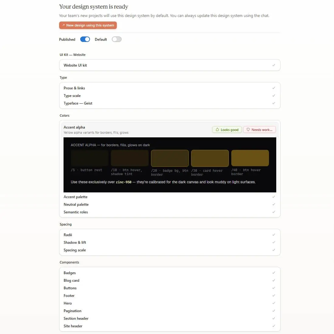
Instead of beginning with an endless list of prompts about mood, style, or colours, I pointed the tool at my existing site. It analysed the patterns, colours, typography, and spacing decisions.
A working design system was born directly from what already existed. I wasn't inventing something new, the generated system already felt recognisable.
This mattered because the system was concrete, matched the existing site, and formed a strong basis for future work.
Redesigning collaboratively
Once the system was in place, the redesign itself became much more straightforward.
Rather than trying to design things in isolation, I worked with Claude Design to redesign the site end-to-end, while referring back to the underlying system the whole time.
This kept changes coherent across the site, even when adjusting layout, structure, and hierarchy. Nothing felt disconnected.
I still had to make decisions, choosing what to prioritise, shaping direction, and overriding suggestions when Claude went too far down a rabbit hole.
Accessibility surfaced early, not retrofitted
One significant benefit of working inside a fully understood design system was that accessibility issues surfaced much earlier.
Because Claude Design had a complete view of the system, it examined combinations of colours and typography up front to identify potential issues.
Contrast issues were flagged immediately. All colours worked well together apart from one dimmer colour variable. Claude Design suggested appropriate fixes that stayed within the existing system and still required final human approval.
Having these issues surfaced and addressed early in the process made a noticeable difference.
The handoff
Once I was happy with the redesign, I could immediately move across to Claude Code to start building.
All I needed to do was provide the Claude Code handoff zip package and use a single prompt to get started. The package contained machine readable content, including markdown, sample HTML, images, and prototyped JavaScript.
The usual handoff process - discussions, clarification, and reinterpretation - was dramatically simpler.
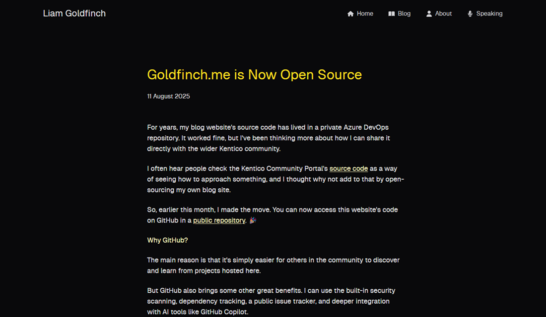
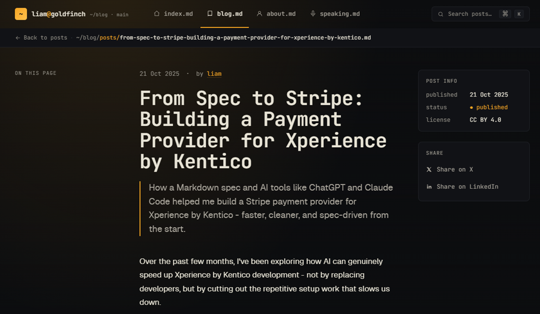
The result of that handoff is the site you're currently looking at.
Where it fell down
There were a few places where the process wasn’t as complete as it first appeared.
The most obvious was responsiveness. The initial designs looked solid, but mobile wasn’t considered until I explicitly prompted for it. It was happy to say things were compatible with mobile, but hadn't proved it. Once prompted, Claude Design generated the relevant previews across desktop and mobile, resolving issues along the way.
There were also subtle inconsistencies in spacing and sizing between components in the designs versus what was implemented by Claude Code. Nothing obvious at a glance, but noticeable when comparing side by side. It felt less like working from a strictly enforced system and more like generating close variations of the same pattern. Consistency was implied rather than enforced.
The cost
One practical observation worth mentioning is that this kind of work is not cheap in terms of token usage.
Claude Design consumed its weekly allowance very quickly, which makes sense given how much system‑level context it keeps in play.
That helped clarify where this fits best. It feels suited to specific parts in the delivery process, rather than as a default, always-on tool.
Final thought
This was a small, constrained experiment on a personal blog - not a test of how this would operate on a large, multi‑channel enterprise build. At that scale, experienced designers would still need to be deeply involved, shaping systems and exercising judgement alongside the tooling.
Claude Design feels most useful not as a replacement for existing workflows, but as a way of collapsing the gap between design systems and implementation - the part of the process that is often the real bottleneck. The real value wasn’t speed - it was the reduction in translation between decisions and implementation.
A natural next step would be to test this in a greenfield scenario, building a design system from scratch and seeing how the workflow differs when nothing is inherited from an existing site.