Have you made your Kentico MVC site widget heavy?
When creating a Kentico 12 MVC website, the page builder functionality comes with one widget out of the box. This is the Form widget which allows content editors to add forms to pages.
Great - this widget works fine, but now your content editors also need to add banners, blocks of rich text, images, carousels, CTAs, article cards, etc. To provide content editors with the extra functionality they require, you'll need to either develop custom page builder widgets yourself, or look at using the growing number of widgets and tools available on the Kentico Marketplace.
Once you start making MVC widgets, you can get carried away with making everything on your website a widget. Ideally, only reusable components should be created as widgets, and the rest should be driven by other means (such as structured content only page types, categories, page relationships, etc). An example of this could be the decision on how a carousel gets embedded on to a Product Detail page. Instead of creating this as a widget, the component could be embedded directly into the view, then the component's visibility and content can be driven by child pages with a custom content only page type called "Carousel Item". This page type would represent one item in the carousel, and control the image or any text to be displayed.
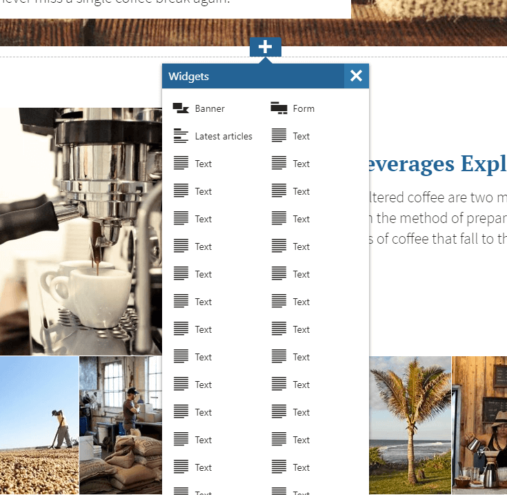
Minimising the number of widgets on a website can be difficult if content editors still expect a large number of widgets to be available. This can be fine until the two column widget selection modal starts going off the screen making it harder to see all of the available widgets.
When this has become a problem on projects I've worked on, I have looked at using either (or both!) of the following techniques to improve the widget selection modal.
Limiting the widgets available
A great way of easing this is to simply limit the number of widgets allowed in an editable area. When adding editable areas to your pages, you can set a list of allowed widgets for that specific area. This gives the content editor a smaller guided subset of widgets which are allowed for use.
For example, the first editable area of a page may be restricted to only allow a Page Heading, Primary Banner, or Secondary Banner widget. The content editor now has a clear list of widgets they should be choosing from, and won't be presented with a bloated list of widgets which may be difficult to use.
Increase widget selection modal size
If limiting the widgets available isn't an option, or you've tried limiting them and still got way too many in the list, you can try looking at increasing the size of the modal to accommodate more columns.
The default modal layout only displays two columns of widgets, but with a small additional stylesheet bundled alongside the Kentico page builder stylesheet this can be easily changed.
Try creating Content/Sections/widget-selection.admin.css inside your MVC website project, and then adding the following:
kentico-pop-up-container .ktc-pop-up {
min-width: 730px;
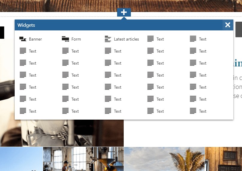
}By default, Kentico's page builder sets a minimum width of 300px for two columns, but the above sample code increases the modal to five columns.
.png?language=en)
As you can see in the image above, having a few more columns can make seeing the entire list of widgets far easier. You don't need to stick with two or five columns either, you could also try:
- Three columns, with a minimum width of 442px
- Four columns, with a minimum width of 584px
You might also be interested in...
Open source meets sustainability: the XperienceCommunity.Sustainability package brings green tooling to Xperience by Kentico - inspired by Umbraco, and already giving back to it.
A few surprises, some near misses, and plenty of lessons learned while getting my Kentico SaaS setup running smoothly.
Learn how I adapted my existing Azure DevOps CI/CD pipelines to automate deployments to Kentico SaaS. This guide covers building, testing, packaging, and deploying to SaaS environments.